


If you’ve been considering building a new fundraising page for your organization or want to be sure your existing page is as effective as possible, this one’s for you!
We’ve put together some best practices you can adopt to ensure your fundraising page is practical and easy to navigate.
Design Your Nonprofit’s Fundraising Page
Visitors can form an opinion of your site in only 50 milliseconds! The best way to ensure your visitors stick around for a bit after they have landed on your fundraising page is to work on your page’s design.
Map the layout of your fundraising page ahead of time to make your work as easy as possible. Here are a few tips you can incorporate as you design your organization’s fundraising page.
Minimal Distraction
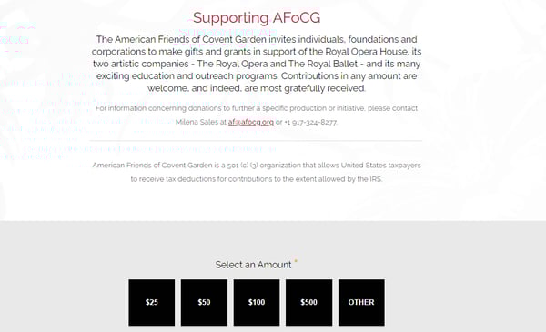
Keep your page clutter-free. Beware of fonts that are challenging to read and colors that strain your eyes. Neon colors are trendy but can be hard to view on any screen. Include only the information and media needed. Take a look at the simplicity of the page below from The American Friends of Covent Garden.
Strategic Button Placement
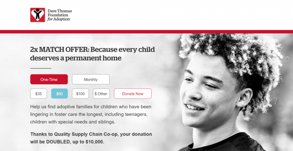
Believe it or not, it matters where you place your donate button and how frequently it appears. Make sure your buttons are easy to find, ideally within seconds of landing on your page. Use catchy colors and clear fonts, so the buttons are as visible as possible. The Dave Thomas Foundation makes excellent use of buttons on their homepage.
Simple Fundraising Form
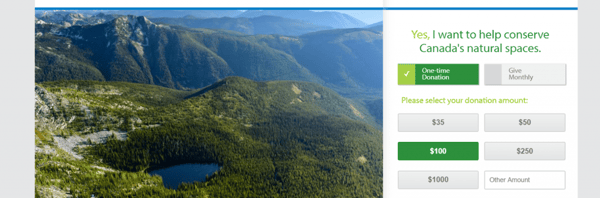
To provide a streamlined donating process for your donors include only as many fields as necessary. Complicated forms with multiple dropdowns can make it challenging to keep your visitors’ attention. Take a look at the simplicity of the donation page for Nature Conservancy Canada.
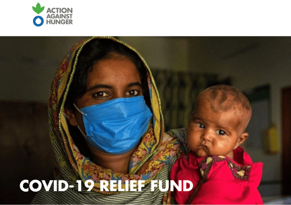
High-Quality Photos
You can include compelling photos to build trust and credibility. Your photos can bring your mission to life in imagery. According to GoFundMe, pages with at least five photos produce better results than pages with just one image. Be sure your photos are at least 1440 pixels wide by 760 pixels tall, so they stay visually sharp and clear. Take a look at the striking image used in an Action Against Hunger campaign.
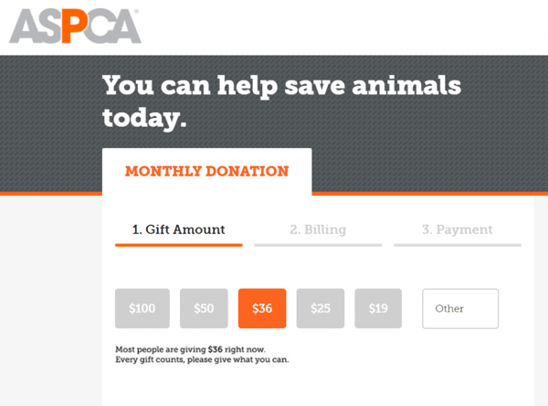
Branding
As you’re designing your fundraising page, it’s essential to maintain your organization’s branding throughout your site. Network for Good reports fundraising pages that include customized branding can raise more than seven times the amount of a page that is not branded. The donation page from ASPCA is an excellent example of using your logo and branding colors in a way that makes your page recognizable.
Write Copy That Inspires Donors
The words you use and stories you tell are everything in fundraising efforts. Elevate your messaging by capturing your audience’s attention fast, making smart word choices, and sharing stories from previous donors.
Keep It Concise
Part of your design strategy should include space for your nonprofit to effectively tell the story behind your mission. Including a narrative explaining the problem you’re helping solve and how it will make the world a better place. Your story can motivate a donor to give and get involved.
Grab your audience’s attention right from the start of your story with a powerful hook. Though you’ll want to capture their attention quickly, use brevity so you don’t lose their attention just as fast. Every word matters, so make them count! Include only what is needed. Facts and figures can help other communications, but a concise story will stick in your readers’ heads and hearts.
Choose Strategic Words
Words are one of the most powerful tools you have to make an ask in fundraising. You’ll want to be sure you’re using the best words possible for a better response. Here are three quick tips on making effective word choices in your fundraising asks.
Use “You”: Make your donors the hero of the story using the power of “you.” Example: rather than “we are working to end child hunger,” try using something like, “Because of you, fewer children will go hungry.”
Don’t ask for donations. Sounds crazy, right? The word “donation” can give the impression that your organization is only interested in their money. Swapping it for words such as “support” or “partner” lets your readers know you are interested in forming a longer-term relationship.
Use the word “because” when explaining why you’re looking for your reader’s support. You can give your readers a reason to partner with you by making small changes to your asks. Rather than saying, “we need more dog food,” you can say, “we need more dog food because no dog should go hungry.”
InvisibleChildren.com incorporates stories from three different beneficiaries on their page in a concise yet compelling way.
Use Personal Stories
Consider including a brief personal fundraising story from a current or former supporter. You can invite your supporter to share a little about why they feel compelled to contribute to your cause.
Perhaps they have a loved one affected by something your organization helps support, or they were attracted to your organization’s fundraising events through other means; sharing a personal “why” can trigger other potential donors to find their “why.”
Optimize for Mobile Fundraising
Once you’ve decided on the design and ensured your words are useful as possible, be sure your mobile viewers can appreciate your efforts by optimizing your page for mobile devices. Because 51% of people will be visiting your website on a mobile device, this is a significant opportunity to attract a broader crowd base.
One of the easiest ways to make your page mobile-friendly is to use a responsive design. Responsive design lets your page quickly load on any type of device and makes it so your viewers don’t need to zoom in or scroll side to side to see the information they need.
The size and style of the font you use are also important for mobile optimization. Keep your font at least a 14 points and steer clear of any over-stylized font styles. If things are not easy on your reader’s eyes, you may lose them.
The size of your buttons is also something to consider for mobile optimization. Make sure the buttons are big enough for a mobile user to tap but not so large that they are intrusive of other elements. Aim to keep button size around 45-57 pixels.
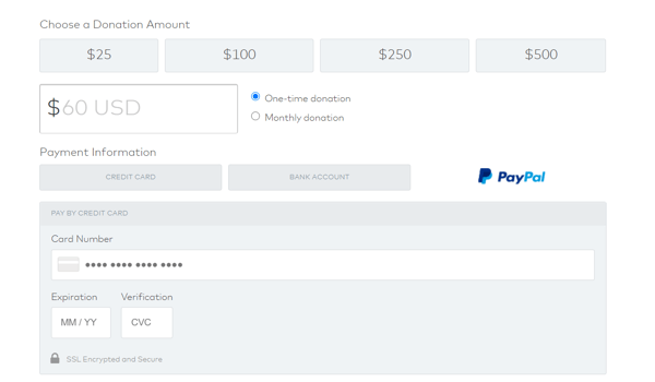
Consider using PayPal as a payment option and adding a linked button for your user’s convenience. If your users are on their mobile devices, they may or may not be holding their credit card. Using a service like PayPal allows your user to bypass needing to enter their credit card information. Make it easy, and they will contribute! Take a look at what this looks like on the water.org page below.
Encourage Participation To Reach Your Fundraising Goal
Though an intentional design and mobile-friendly page will be enticing to your visitors, you’ll still need to provide additional encouragement for optimal donor engagement! We’ve put together some of our favorite ideas for generating excitement and enthusiasm around supporting your cause.
Gamification
Gamification is simply applying a fun spin on something that’s not a game at all. Not only does everyone love the excitement of a game, but it can boost engagement fast! A few easy and design-friendly ways to incorporate this into your fundraising page are:
- Progress bar: Add a bar showing your goal and how far you are from reaching it. Seeing you’re only $200 short of your goal may be just the push a donor needs to make the donation that gets you there!
- Leaderboards: You can appeal to your more competitive supporters by having a leaderboard on your fundraising page. You can add a scrolling list of your top donors or individual donors who fundraise on your behalf in peer fundraising or crowdfunding campaigns.
Call To Action
While you know exactly what you want your visitors to do, they may not be entirely sure. Make it clear by being strategic in where you place your calls to action. This is something you can test to see what works best for your nonprofit organization specifically, but generally, it’s best to include one at the top of your page and at least one other towards the bottom.
Social Media Integration
Social media is a goldmine for likes and shares. Include a way for your supporters to share their contribution on social media in just a few taps from your confirmation page. You can include a social media toolkit right on the confirmation page your donors use after they’ve made their contribution.
Include things like your campaign hashtag and some social graphics so they can easily share their support and promote your efforts. You can also include buttons linked to social media sites that donors can click to share their recent support in their network.
FAQs
It can be a challenge to balance the need for keeping your text minimal with the need to share relevant information. Some donors may have specific questions about your fundraising campaign that are not answered in your storytelling.
You can consider adding a dropdown in the header of your page that includes a selection of FAQs. Include information about whether their contribution is tax-deductible and when a donor might expect to receive a donation receipt.
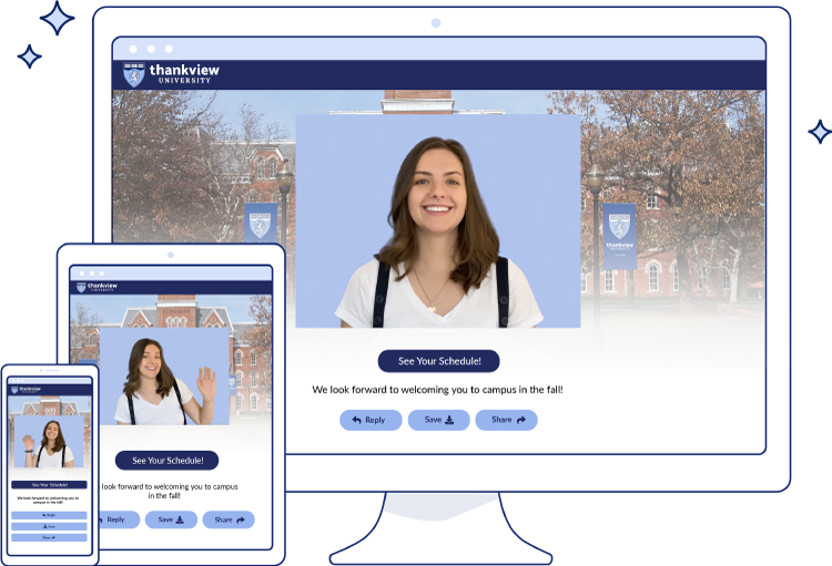
Follow Up With a Personalized Thank You Video
A successful campaign should include personalized thank yous. With ThankView, you can easily send personalized thank you videos via text or email. If you’re interested in finding out how you can follow up with your donors in a way that is sure to surprise and delight — reach out to our team today for a demo!