Logo_SecondaryLogo_WhiteReversedLogo_HorizontalLogo_Web_RGB_SVG

The Dos and Donuts of Accessibility

This written guide and the accompanying video walk through the basics of accessibility, what features you should expect from your digital tools, and what you can be doing every day to make sure your organization connects with the most people possible. 

Download the PDF Guide

This written guide and the accompanying video walk through the basics of accessibility, what features you should expect from your digital tools, and what you can be doing every day to make sure your organization connects with the most people possible. 

Chapters

01. The Audience
Learn about types of disabilities and the assistive technologies designed to help them.
Jump to Chapter
02. The Lingo
ADA, WCAG, and beyond! Check out commonly used acronyms and how users perceive and understand your content.
Jump to Chapter
03. The Tools
Understand what to expect from your digital communications tools and how ThankView can aid you on your accessibility efforts.
Jump to Chapter
04. The Action
Access on-demand courses that are industry specific, actionable, and earn you a ThankView badge of honor!
Jump to Chapter

Chapters

01. The Audience
02. The Lingo
03. The Tools
04. The Action

CHAPTER ONE

Who are accessibility features for?

If you’re thinking the interest in the accessibility of software seems to be much higher than in the past, you’re correct. Attitudes are shifting, in no small part due to recent lawsuits challenging companies who have produced inaccessible software.

WhoareFeaturesFor?


Perhaps most notably, in 2019 the Supreme Court did not take up a case against Dominoes in which a blind person sued the company over the inaccessibility of the ordering feature of their website.

By not taking the case, the Supreme Court left in place a ruling by a lower court that ruled the ADA does apply to websites, and that Dominoes must ensure its website is usable by the blind. Don’t ever let anyone tell you that pizza can’t make a difference in the world.

LightBlob

26%

of American adults have
1 or more disabilities


- The Center for Disease and Prevention


Now, you may believe you know your audience extremely well, and that no one you’re reaching out to has a disability. If your audience is incredibly tiny, that might be true. But according to the CDC, 26% of American adults have 1 or more disabilities - That’s 1 in 4 people!

It’s statistically unlikely no one in your audience has a disability. It’s also likely that many members of your audience simply haven’t disclosed their disabilities, or even may be unaware they have one, so it’s best to be prepared.

Types of Disabilities

There are five disability types that are considered in digital accessibility: seeing, hearing, speaking, moving and cognitive.


  Vision disabilities - blindness or partial loss of vision and color blindness

  Hearing disabilities -refer to deafness or hearing loss, or auditory processing difficulties

  Speaking disabilities -encompasses impediments or disorders that make speech or understanding speech difficult

  Moving disabilities -anything that inhibits use of a limb, or general mobility. This can also include vestibular disorders, which are disorders of the inner ear and balance

  Cognitive disabilities -include conditions such as autism, attention deficit, dyslexia, dyscalculia, and memory loss. These are only a few examples of cognitive disabilities, but broadly speaking it refers to any difficulty in attention, processing speed, memory, logic & reasoning, and language processing.


For most of your communication tools, the items you have direct control over will likely be things that impact people with vision, hearing or cognitive disabilities. Things like the colors you use, the types of content you’re sharing, and the wording of your messages.

In the section below, we’ll discuss specific considerations for these areas and cover guidelines related to them so you can be sure your content is meeting accessibility requirements.

Examples of Assistive Technologies

The most common piece of assistive technology most people are aware of is probably a screen reader. A screen reader runs on a device and provides a means of navigating through different interactive elements and content on the screen. It then reads the content out loud to the user.

For people with vision disabilities, screen readers enable a level of access that would otherwise be impossible. The most common screen reader softwares in use today are:

JAWS – a licensed screen reader software for Windows
NVDA – an open-source screen reader for Windows
VoiceOver – the built-in screen reader software for macOS and iOS
TalkBack – the built-in screen reader software for Android

Other forms of assistive technology for vision disabilities include:
  • Screen magnifiers – which allow zooming in and out over sections of the screen
  • Braille embossers – which transfer text from the computer to braille output that can be felt by a persona


While screen readers are great for helping people understand what is on the screen, other assistive technology helps with providing input. A few examples are:

  • Specialty mice or keyboards
  • Single-button switch inputs
  • Sip-and-puff systems which allow input by breathing in or out of a tube
  • Electronic pointer devices which can use alternate inputs such as eye tracking, ultrasound or infrared to point and click at items on a screen
  • Keyboard filters which may use predictive typing to aid in faster typing
  • Speech recognition programs for interacting by voice

This is not a comprehensive list of accessibility technology, but it demonstrates that people experience computers and digital content in a wide variety of ways.

If you want to ensure your content can reach as many people as possible, you need to consider these alternative means of access, and take steps to ensure people have an enjoyable experience with our content no matter how they use their computer.
Donut_spacer

CHAPTER TWO

The Lingo

Let's learn how to talk the talk while walking the walk -from ADA, WCAG, and beyond! Check out these commonly used acronyms and learn how users perceive and understand your content.

LearntheLingo

ADA and WCAG

When people think about accessibility, what most often comes to mind is the Americans with Disabilities Act, or ADA. But being over 30 years old, it doesn’t explicitly account for digital tools, services, and communications. 

Recent legal precedents set by the court system have made it clear that the ADA does apply to software and digital communications.

But if the ADA doesn’t explicitly define requirements for software, what does? 

The World Wide Web Consortium, or W3C if you like fun initialisms (we do!), is a governing body responsible for defining different standards for the web. They publish a set of guidelines that describe how software, websites, and other digital communications should be built and behave to accommodate varying disabilities.

These guidelines are called the Web Content Accessibility Guidelines, or WCAG. (more acronyms!) 

These guidelines are updated and versioned from time to time to reflect changes in the web and assistive technologies, and as experts continue to learn more about how to provide accessible experiences to people with disabilities. 

For the different criteria covered, there are different levels of conformance: A, AA, and AAA. Each level provides greater accessibility at the expense of more effort. ThankView, along with the industry at large, aims to comply with WCAG version 2.1 at level AA.

WCAG is extensive, but at a high level, WCAG has 4 primary areas of concern important for you to consider when posting or sending digital content:

Can users perceive the information on your site?
This area of concern is primarily around physical access to the information you’re trying to share. It includes considerations to accommodate vision and hearing disabilities and supporting technologies.
It covers things like text and color contrast, text descriptions of images, video and closed captioning and transcripts, and more.


KeyboardandMouse

Can users operate the controls and links on your site?
This covers methods of building websites and software to ensure compatibility with many means of user input and assistive technology.


The result? Making sure user interface controls can be manipulated by both mouse and keyboard, and other assistive controls. It also contains guidelines for what controls to offer for content with motion or audio, such as video or decorative animations.


For the most part, this whole category of requirements is on us and your other vendors as the software developers to ensure compliance, so we won’t be diving deep into this category.


Can users understand your content?
This area covers things like ensuring users browsers know which language the content is in, the complexity of your content, use of abbreviations or obscure terminology, clarity of user interface labels, and a whole lot more. We’ll dive into some parts of this area around language complexity later on.

Is your website robust enough to work on your users' browsers and assistive technologies?
The final area of concern centers on ensuring the way software and websites are built makes them work in whatever browser or assistive technology someone is using. Again, this area is on your site development, so we won’t cover it in much detail.

The four areas WCAG covers can be more easily remembered by the acronym P.O.U.R., with the letters standing for Perceive, Operate, Understand, and Robust. The sections most readily under your control when communicating with your supporters in your digital communications fall under Perceiving and Understanding, so that’s where we’ll focus our discussion going forward.

That said, if meeting a broad range of accessibility requirements is something you’re concerned about, we hope this introduction is the launching pad for more questions!

To dig deeper, we recommend checking out the condensed overview of WCAG 2 and this overview of the WCAG 2.1 update.

Donut_spacer

CHAPTER THREE

What to expect of your digital communication tools

Now it’s time to take your newfound knowledge and access the digital tools you use. We’ll use ThankView as an example, but we are by no means finished with our accessibility work and we are not alone in making great strides.

WhattoExpectofDigitalCommunicationTools
Changes ThankView has Made
(and will be making in the future) 

We’ve conducted our own initial audit with an automated testing tool called axe.

Axe is one of the most widely used accessibility auditing tools in the industry and powers lots of tools offered by the likes of Google and Microsoft. Which is to say, it’s pretty good.

Axe tests against WCAG 2.1 criteria for level AA compliance (you know this stuff now! And if you skipped the first section you’re missing out).

With axe, we’ve discovered and fixed dozens of accessibility errors throughout the ThankView platform. Using axe is now part of our standard QA process, and new features are not released until they pass an axe audit with 0 issues.

We’ve also been actively developing our own in-house design system full of interface components that adhere to WCAG 2.1 at level AA. You can think of these components as user interface Legos. As often as possible, our design team uses these standard UI building blocks in their work.

When a new component is necessary for some feature, we take time to think through accessibility requirements and develop the component first, before building the feature. This work is not complete and we have a lot left to learn, but we approach our work with accessibility in mind from the beginning.

Our commitment to this work is published on our website at thankview.com/accessibility. There you can find how to contact us with accessibility concerns if you have any questions or feedback.

That’s our approach. When it comes to your other communications tools, here’s what we’d ask if we were evaluating the accessibility of their products.

Here's a nifty email you can copy and paste to your representative.

Hello Computer Person,

Here at (name of your organization) we’re looking to ensure that the digital tools we use 1) meet ADA requirements and 2) meet our own internal standards for accessibility.

Can you answer the following questions for me?

What accessibility guidelines do you aim to meet?
How often do accessibility audits occur?
Where in your development cycle do accessibility checks take place?
How can we contact you if we have specific accessibility concerns?
Do you have an accessibility best practices guide for authoring content in your products?

Thank you for taking the time to answer these questions. I look forward to hearing from you soon.

Beep Boop,
(Your Name)

Donut_spacer

CHAPTER FOUR

What can you be doing?

Alright, alright. Let’s dive into how you, yes, you, today, can ensure the content you’re sharing is accessible.

accesibilityguide_Illustrations_Uni
A Colorful Start


When it comes to your use of color, the main accessibility consideration is the contrast between the colors you use for text and its background color. So let’s ask ourselves, what exactly is “contrast”?

This is going to get a little technical, so hold on tight.

Computer screens use what’s called additive color. Everything it displays is a combination of red, green and blue in different amounts.

If you turn up red, green and blue all to 100%, you get white and if you turn them all off of course, you get black. Creating colors this way lets a computer screen show 16.7 million different colors!

Okay, but that just gives us the colors. To determine the contrast of two colors, we have to measure the relative luminance, or how bright the color appears compared to pure white. 0% luminance is pure black, and 100% is pure white.

To measure the contrast between two colors we simply calculate the luminance using this fancy formula, which accounts for how bright each red, green and blue are perceived by the human eye.

Luminance = 0.2126*R + 0.7152*G + 0.0722*B

Once you have the two luminance values of your colors, you simply divide them, while accounting for another display brightness factor called gamma, and BAM! Contrast ratio.

Wait, wait, wait. Before you click out and think that calculating contrast ratio is something you could never do, there’s a website that does all the work for you.

Contrast-ratio.com

With this site and similar tools, you simply enter the colors for your background and text color, and it gives you the contrast ratio.

For example, let’s calculate the contract ratio of the CTA button on this page:


unnamed

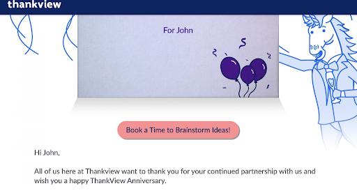
On Contrast-ration.com, simply enter your button color as the background and your text color to check the ratio. If it says 4.5 or higher, you’re all set! If the contrast ratio is below 4.5, consider updating your landing page design with new colors with higher contrast.
You might be saying, “Wait, just a minute. I’m not sure what my color codes are.” No problem! It’s easy with sites like Image Color Picker. Upload a screenshot and highlight the color you’d like to use.

unnamed (1)

After testing the button colors on the landing page above, we see that they meet the 4.5 standard. Way to go, ThankView from the past!
Alright, now that we have the contrast ratio of our beautiful brand colors, what’s next?

Remember that if you’re working with images that contain text, the contrast requirements also apply to the text in those images. Which, coincidentally, is our next topic.


Tell Me What You See


For images, you must provide a text description of the content of the image.

When writing alt text, you want to convey the key information the graphic provides. If the image contains text, your alt text must also include that text. If the text in the image is the only important bit of content, you’re done!

But if there’s more detail that’s important to understanding the message, or no text in the image, then you’ll need to write a description that conveys the same information as the visual.

Important: You don’t need to describe every detail of the image, just the parts that are important to convey what you want the image to communicate. It’s important to be as concise as possible.

Avoid phrases like, “image of,” or “picture of,” in your alt text. Screen readers will already indicate to people that they’re looking at an image, so you don’t need to state it again.

Take this image from our blog post “How to Recruit Volunteers: Find and Inspire the Right Volunteer.” It’s a great article by the way, you should check it out.

unnamed3

The alt text for this photo: “Group of volunteers looking over a clipboard”

The Moving Picture


Next, we have to talk about moving pictures. And no, I don’t mean videos (we’ll get to those next). We all love a fun animated gif. Indeed, we use them a lot in our own communications, but like your favorite-flavored donut, it is possible to have too much of a good thing.

There are disorders that affect the inner ear and nervous system called vestibular disorders. Symptoms of these disorders can be triggered by excessive unexpected movement on a screen.

Fast, fun, animated gifs? If someone isn’t expecting them – or in extreme cases even when they are – they could experience motion sickness, migraines and headaches, vertigo, or other physical symptoms that make them feel sick. No matter how great your message is, it shouldn’t make someone feel sick just by viewing it!

Now, that doesn’t mean you can’t use your fun gifs. Trust us, we don’t want to give them up either. But it does mean they need to be used responsibly.

When using animated gifs, avoid putting too many close to each other, especially if they contain fast movement or rapid color or brightness changes. Avoid making them overly large - they probably don’t need to span the full width of your email or webpage for example.

An animated gif should not be the first bit of content someone encounters when opening your email. Placing them further down decreases the likelihood of someone encountering it unexpectedly. And just like still images, animated gifs require alt text descriptions for anyone who can’t see it.


Video


Just like animated gifs, autoplaying videos can trigger symptoms of vestibular disorders.

Whenever you’re able, consider not autoplaying video. Sometimes, this is beyond your control, but the best tools can still have your back. All recent versions of major operating systems provide a setting for people to indicate they would like instances of motion reduced.

In the ThankView platform, we check that setting when loading your videos. If your recipient has indicated they prefer reduced motion, we’ll automatically prevent auto playing of the video. We also use a simplified envelope animation for the same reason. Then, someone can watch the video when they’re prepared.

The primary accessibility concern with video is one you’re probably already familiar with: captioning!

accesibilityguide_Illustrations_RobotA survey conducted by 3PlayMedia found that 98% of people reported watching videos with closed captions. That’s astounding! Among them, only 25% said they used them to accommodate a hearing disability.

Similarly, a 2006 study from Ofcom estimated that of the 7.5 million UK TV viewers using subtitles only 1.5 million had a hearing impairment. Like most accessibility best practices, the benefits are for everyone, not just people with disabilities.

The takeaway here: always provide closed captions for your video content.

In ThankView, we offer a few ways to add captions to your videos. We offer AI-powered machine translation and the ability to upload your own captions file both for free, and for a small fee, we’ll ship your video off to our partners at Rev, where a real-live human will caption your video with 99% accuracy within 24 hours. Now that’s a sweet deal!

Whichever method you use, you should always review the captions for accuracy. This is especially critical when you use the AI captioning, as it’s only 80% accurate at this time. Our machine captioning is currently powered by Google, so it doesn’t get much better at the moment.

You should also consider paying for a human captionist if your video contains important music, sound effects, multiple speakers on screen at a time, or off-screen speakers.
accesibilityguide_Illustrations_UniCaptions
Our machine captioning currently cannot include music, sounds, or differentiate between speakers and these are all critical pieces of captioning for people who depend on them. For videos you publish on other platforms, check if they offer machine captioning with the ability to edit for accuracy, see if your organization offers captioning services for you, or consider a service like Rev to meet your captioning needs.

Your Words Have Power
We need to talk about words. Not the ones you say out loud, but the ones you write down. In addition to the text color contrast requirements which we went over earlier, there’s a few more formatting considerations to keep in mind.

First and foremost, we need to talk about text alignment.

Sometimes center aligning text can be a great stylistic choice. But it becomes a problem when the text is too long. When a whole paragraph is center aligned, it becomes difficult for people to read because each line of the paragraph starts in a different place.

Even if the person reading it has perfect eyesight, trying to read centered text will slow them down, and make the message more difficult to understand. So let’s keep those centered pieces of text to very short sentences.

If the tool you’re working with also allows you to create large header text, be mindful of the different levels you’re using.

Screen readers use header text as landmarks to aid in speedy navigation of the content. If you choose a header style purely for its visual appearance, you may inadvertently create a confusing structure for someone viewing your content with an assistive device.

Whatever the largest header option (H1) is, you should only use it once per document, generally as a title or header for the entire piece.
From there, your headers should get smaller according to how the content is grouped. The key thing here is don’t skip a heading level. If you use the largest header option for, say, a blog post title, and then use the 3rd largest header style for all the other section headers in the post, the resulting structure will be a bit confusing for a screen reader to navigate.

If you’re ever in doubt about the surrounding content of whatever you’re writing, the safest choice is to use the 2nd largest heading option. That way you don’t accidentally repeat the largest, most important header in one document, and you can be sure you aren’t skipping the second heading level.

Ending with a Smile
Let’s talk about emojis.

They’re fun, personal, and an easy way to add a splash of pizazz to your emails. But did you know that every emoji has an official name? Emoji characters are defined as part of the Unicode text standard, which is one way of encoding text on computers.

When a screen reader encounters an emoji character, it announces the full name of the emoji. And some of these names are pretty long!

Take for example this simple one: 😊 It’s full name? “Smiling face with smiling eyes”.

That’s not too bad, but what if there were a bunch of them in a row like this?

😊 😊 😊 😊 😊

A screen reader will announce all 5 of them in a row! Which is to say, emojis are awesome, but to be as inclusive as possible, avoid using too many in a row before your content.

When using them in an email subject line, we recommend limiting yourself to just 3, and don’t put more than 2 before the rest of the subject line.

Artboard 1Blue